I came across an article called “It Doesn’t Pay To Work” which presents a graph and argues that welfare must be cut dramatically. However, it completely misinterprets the message of the graph. The problem with welfare isn’t the total amount, it’s the shape of the curve.
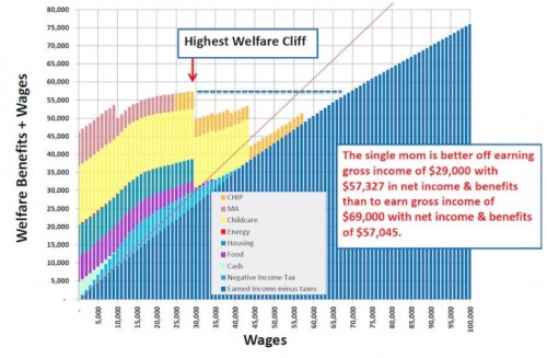
The graph presented in the article is this:
I do not know how accurate this graph is. For now, for the sake of argument, I will take it on its face value: I will assume that the numbers are correct and that they represent the true relationship between take-home benefits and earned income for a household with a single mother and children.
As you can see in this graph, there are a lot of different benefits that a single mother is eligible for at the very low income end of the spectrum (the left side of the graph). As her income gradually increases, there is a kind of “phased step-down” of benefits. What the graph’s creator has done with the dotted blue line and the red arrow is to show that the single mom’s take-home pay is the same when she is earning $29,000 per year as it is when she is earning $69,000 per year, because of the benefits that she receives if she is earning the smaller salary.
Obviously, this kind of situation is “demotivating”. If I can work less, or work at a less challenging job, and take home exactly the same amount of money, then why would I try to work harder? Now, of course, any real human being who isn’t out to demonize the poor knows that some people will always work harder anyway, because they want to challenge themselves and take things to the next level. But conversely, even the most optimistic liberal will have to admit that there will always be some people who look at this situation and say, “Meh…. I’d rather work for $29,000 and spend my spare time watching T.V.” Not everyone will do this; but some inevitably will.
Based on this “demotivation” argument, John Hinderaker, the author of the article where I found this graph, concludes that welfare payouts are altogether way too high! We need to cut welfare dramatically in order to remove this demotivating effect!
But that is the wrong conclusion. Worse: it’s an obviously wrong conclusion, just from looking at this graph and the argument that John makes from it.
What is causing the “demotivation effect” is not the overall amount of spending on welfare benefits. Just look at the graph, and the dotted line and the red arrow: what is causing the “demotivation effect” is the shape of the curve.
Specifically, the reason that you get the problem that is pointed out with the red arrow is that there are places on the graph where the slope is decreasing: where the total amount of money you take in decreases as a function of the total wages you earn. That is the problem. That is what leads to there being two points on the same graph with the same take-home pay (the y value) despite having different earned income levels (the x value).
The way to fix welfare, then, is not to make “drastic cuts” in welfare. The solution is to smooth the curve: arrange the benefits so that they are phased out gradually, and the slope of the total curve is always increasing. As long as the slope of the total take-home pay function is always increasing, even if only by a little bit, people will always have an incentive to push themselves a little more: aim for that raise, or add those extra hours.
On the flip side, it would be possible for some very stupid lawmakers to make severe and extreme cuts in the overall amount spent on welfare, but still not fix the problem. How? By keeping these “cliffs” in the way that welfare benefits are phased out. No matter how large or small the benefits, if there are “cliffs” (i.e. places where the slope is decreasing), then there will be a demotivational effect.
How can we go about smoothing the curve, without breaking the bank? Are there practical issues that arise with gradually phasing out benefits, rather than having these “cliffs” with dramatic decreases happening at certain earning levels? I don’t know, and I am sure it will take work to figure these things out.
However, I do know this: even a plain-sight reading of this graph makes it obvious that the amount paid in welfare isn’t the source of the demotivation problem. The source of the problem is the slope of the curve.


