I’ve ranted about lying with statistics and statistics abuse before. This time, though, it overlaps with another of my favorite topics: taxes.
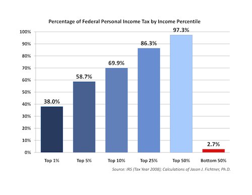
For a very long time now, the silk-voiced and soothing Mark Levin has pushed the idea that our tax system is horribly skewed and unfair against rich people. His evidence for this is the fact that the top 5% of income earners pay more than half of the federal taxes, while the bottom 50% pay 2.7% of the federal taxes. He announces this on his radio show, where nobody can question him about this statistic.
Is the statistic incorrect? No. But it also doesn’t mean what Mark wants you to think it means.
To look at this more closely, let’s look at an actual graph from a paper produced by the conservative think-tank The Mercatus Center and gleefully tweeted by Mark Levin.
 Now, what does this graph mean? The y-axis label is missing, and the title is ambiguous. It isn’t the percentage of a person’s income that is paid based on their tax bracket. (We’d be a lot better off if it were.) It is the contribution of each income group to the total federal tax revenue.
Why is this a misleading graph?
Because the amount that a group contributes to the total federal revenue isn’t just based on their Tax Rate, it is also based on their Total Income. The more skewed the income of the top 1% is compared to the average income, the more skewed this graph will be. In other words, the skew in this graph is caused by two things: uneven tax rates, and uneven distribution of wealth.
Just to make sure that this idea is clear, let me give you a specific example. Let’s imagine, hypothetically, that incomes in this country look like this:
| Average income of someone in the top 1%: | $2,280,000 |
| Average income of someone in the top 5%: | $310,500 |
| Average income of someone in the top 10%: | $134,400 |
| Average income of someone in the top 25%: | $65,600 |
| Average income of someone in the top 50%: | $26,400 |
| Average income of someone in the bottom 50%: | $3,240 |
I made these numbers up, but what’s your gut-level reaction? Fairly realistic? Maybe a little exaggerated? Yes, I thought so, too.
But here is the punchline: With those income distributions, a completely flat tax would produce the dreaded Mark Levin graph, above. That’s right: even with the absolutely most “fair” (according to conservatives) and non-progressive tax rate, you still see a huge inequity in the amount of money each income strata contributes to the federal deficit.
If the average income of the top 1% is more than 700 times the average income of the bottom 50%, then the top 1% will pay almost all of the taxes no matter how flat the rate is.
It’s basic math. The amount that you contribute to the deficit is partially based on tax rate, and partially based on your income. The more income inequality there is in the country, the more of a skew there will be in how much each group contributes to the deficit.
That is why this statistic, while numerically true, is presented as a lie. Because despite that Mark Levin would have you think, it isn’t showing you the unfairness of the tax rate: it’s showing you the inequality of income distribution in this country.

