When the media talks about “radicalization” it’s always in the context of Muslims and terrorism and violence. I’d like to take a different approach: measuring the “radicalization” of a population using Presidential approval numbers.
The word “radicalization” means becoming more extreme. It is the opposite of “moderation” which means becoming more moderate. A population that is made up mostly of people on the political extremes is a “radicalized” population. A population that is made up mostly of people in the middle of the political spectrum is a moderate population.
Can we use poll responses to detect radicalization in a population? Let’s consider a fairly generic “approval” type of poll question, where people can evaluate their attitude toward a particular issue or person by responding with: strongly approve, somewhat approve, somewhat disapprove, or strongly disapprove. Is there a way to detect whether a population is moderate or radicalized, based on their pattern of responses to “approval” questions on various issues?
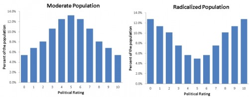
First, let’s look at some idealized hypothetical scenarios, and think about what the “expected” pattern would look like. In order to do this, I’m going to imagine two kind of “archtype” populations: the Moderate Population and the Radicalized Population. If we had people in these populations rank their political philosophy from 0 to 10, where 0 is “extreme liberal” and 10 is “extreme conservative” and 5 is “exactly in the middle moderate”, the distribution of responses would look like this:
As you can see, in the Moderate Population most people are 5’s or thereabouts, while in the Radicalized Population most people are at or near either 0 or 10. This is how we’re defining the idea of “moderate” versus “radicalized” for the sake of this exercise.
Now, what do these people think of a candidate who is the perfect “moderate” exactly-in-the-middle candidate?
Just for this exercise, let’s make an assumption: Any given person will evaluate a candidate by looking at the difference between the candidate’s political rating (0-10) and their own. If the difference between themselves and the candidate is small (0-1) then they will “strongly approve”; if there is a bigger difference (2-3), they will “moderately approve”; when the difference gets large (4-5), then they will “moderately disapprove”; and if the difference between themselves and the candidate is very large (6 or more) then they will “strongly disapprove”.
The specific numbers here are kind of arbitrary, but the analysis doesn’t change that much if we put the boundaries at different numbers. The important assumption is: the bigger the difference, the less the person will approve and the more they will disapprove.
 Using this basic model, and the distributions above, we can predict how the population will rate a completely neutral, completely moderate, “perfect 5” (on the scale from 0 to 10) candidate.
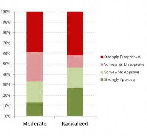
The most interesting thing about this is that nobody strongly dislikes the candidate, in either the moderate population or the radicalized population. When the candidate is truly in the middle, nobody is far enough away from him to hate him that much.
The telling difference between the moderate and radicalized population is that in the radicalized population fewer people strongly approve, and almost half of the population disapproves of the candidate. The reason half of the radicalized population disapproves is that most of the population lies at the extremes: so the extreme liberals will say “too conservative!” and the extreme conservatives will say “too liberal!”
What will the polling results look like for a partisan, but not extreme, candidate? For the sake of argument, let’s make the candidate a Moderate Liberal (2 on the scale).
 In this case, both the moderate population and the radicalized population put the overall approval of the candidate at 60%. The difference is that feelings are simply stronger for the radicalized population than for the moderate population. This goes in both directions: more people strongly approve, and more people strongly disapprove, in the radicalized population than in the moderate population.
When looking at this graph, compared to the previous one, there is an interesting lesson for aspiring politicians: If you are running for an election in a radicalized population, you are better off being partisan than moderate. In the “Radicalized” column above, the moderate candidate gets 50% approval; in the “Radicalized” column here, the partisan candidate gets 60% approval.
If you are running for election in a moderate population, the situation is reversed: the perfect “moderate” candidate gets an overall approval of 75% from the moderate population, whereas the liberal candidate gets a 60% approval rating.
Lesson: Whether you are better off running as a moderate or a partisan depends on how radicalized the population is.
Now, what will the polling data look like (using this model) for a radical candidate? Just for kicks, let’s make the candidate a radical liberal (score of 0 on our rating scale).
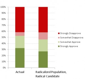
 Now this is interesting. In a moderate population, being a radical candidate means “Game Over”: 35% approval, 65% disapproval, with almost 40% of the population strongly disapproving of the radical candidate.
However, in a radicalized population, the approval of a radical candidate is just under 50%. Notice that this is the case even though exactly half of the population is radical on the same side as the candidate and half of the population is radical on the opposed side from the candidate.
Another interesting feature of the graph for the Radicalized population is the asymmetry in the composition of the “approval” versus the “disapproval” sides. According to this graph, within the roughly 50% of the population that “approves” of the candidate, about half of them “somewhat” approve and about half “strongly” approve. The same is not true on the disapproval side: a very strong majority of the people who “disapprove” also “strongly disapprove”, with only a small share of them only “somewhat” disapproving of the candidate.
Now, just for fun, let’s take a look at the most recent Rasmussen poll results.
 I am putting the actual numbers side-by-side against the theoretical results that we got for a Radical Candidate being polled in a radicalized population. They look kind of similar, although I don’t want you to necessarily read too much in to that.
This result could mean that we have a radicalized population, and that the population (overall) perceives Obama as being a radical. This is probably true on the conservative side: conservative talk show hosts say every single day that President Obama is a radical liberal. However, I don’t think this is true on the liberal side: I know many “extreme liberals” and most of them consider Obama to be too moderate for their tastes. This suggests to me that the people in the population who would rate themselves as 0 or 1 (on the scale we’ve been using) would evaluate President Obama as a 2 or a 3, even if extreme conservatives (9 or 10) might rate Obama as a 0 (radical liberal).
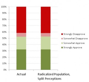
One final graph: what if we actually take this kind of perceptual discrepancy into account in the model? Let’s adjust the graph above to compare the actual data with the following scenario: Anyone on the conservative side of the spectrum (6 or higher) sees the candidate as a totally radical liberal (0); moderates (4 or 5) see him as slightly less radical (1); moderate liberals (1-3) see him as being a moderate liberal (2); while radical liberals see him as being only slightly liberal (3).
Once again, the specific numbers are a little arbitrary, but if you play around with them a little you will see that the specific numbers don’t matter that much. The critical pattern is that the following groups see the candidate as being decreasingly moderate, with the last group seeing him as a total radical: radical liberals, moderate liberals, moderates, conservatives.
A quick summary of what we are seeing in this graph: The approval ratings that we see in the latest Rasmussen polling can be explained perfectly by assuming 1) the population being polled is a radicalized population, with more people at either extreme than in the middle, and 2) the candidate is perceived by the population as anywhere from radically liberal to moderately liberal depending on the political orientation of the person being polled.
So what does this mean?
This model represents one possible explanation of the polling data. Of course, there could be other explanations. I’m sure there are different models, with different assumptions, that could also fit the data.
But this result is suggestive. It means that we definitely can’t rule out the hypothesis that we are operating within a strongly radicalized electorate. In fact, assuming that we have a strongly radicalized electorate is one way to perfectly explain the data that we see.
I’d like to do more analyses like these in the future. I think it’s interesting to think about the fact that patterns of approval numbers don’t just tell us about candidates… they tell us about the collective personality of “the people” as well.


